

It has been clear for a while now that we as a culture have embraced celebritism as a most essential element and vehicle of success. We chase, photograph, Tweet, talk about, and otherwise fixate on people who in many cases are famous just for being famous. Even worse, we give nearly unlimited veneration to people who pretend their life experience confers expertise and has relevance and value in any sphere in which they choose to dabble. The culture of celebritism risks taking over and toppling the culture of expertism, and much else along with it—all supported by a commercial model from which very few of us benefit.
Thus at the recent Art Basel Miami Beach (ABMB), one of the highlight events was rapper Kanye West taking center stage to discuss design with a famous architect, under the auspices of a famous curator. Yes, West says he was an artist as a young(er) man, but still: there is a difference between having an interest in architecture and being an architect or a critic prepared to attack or defend from a position of knowledge. Might Mr. West have interesting views or perspectives? Sure. But alas, what validates them is his celebrity as a rapper, which hardly seems like the right credentializing process. Gone, it seems, is even the vague glimmer of skepticism that followed U2’s lead singer Bono when he began exploring global economic issues more than a decade ago. Bono, meanwhile, has proven himself a terrific student of the subject, having invested copious time in the hard work of learning. So far, the evidence of similar behavior by Mr. West seems thin; it is more about grandstanding than impact.
I’m not here to criticize Mr. West, however. It’s hardly his fault that the rest of us are so willing to submit ourselves to such silliness. Fool me once, shame on you. Fool me twice…
After a visit to ABMB this week, I cannot help but be more than a little depressed at the circus that it was–and the way the social imperatives overwhelmed everything else. Walking around, people seemed consistently more interested in the see-and-be-scene and celebrity sighting aspects than in the art. What could encapsulate the absurdity of that better than the story of Jeffrey Deitch apparently mistaking Sean “Diddy” Combs for Kanye West?
If ABMB and all of the attending brouhaha helps living, working artists sell art, then it is worth it. Free markets can be terrific, and this is no less true for artists than anyone else. I begrudge no artist the opportunity to sell their work for the best possible price, and gallerists or dealers make sense as supporting partners for these transactions. Moreover, the marketplace is a common point of entry for emerging artists seeking recognition: galleries present their work, patrons buy it, and word spreads. But it is a bit hard to believe this is really the case here, let alone to take ABMB seriously as a process. Walking around this and other fairs certainly does not suggest a culture of serious art engagement. Instead it feels like a fixation with fashionable art names—and fashionable prices—that is not much different in practice from our veneration of celebrities.
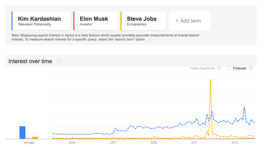
Some aspects of celebritism are unavoidable at a macro level; it might just be who we are as a species. Look back in The New York Times archives and a story from November 29, 1877 about a reception for 3,000 people at the Metropolitan Museum of Art hits the A List names as close to the start as just the third sentence. It’s a question of balance and proportion. Right now what we have is imbalance and disproportion, not just in the world of art and design but in almost every sector of society. The Kardashians and their ilk get as much attention even as celebrity business leaders, despite the fact that the business leaders actually run organizations that create new products and add value to our lives in concrete ways. Google’s Trends tool even bears that out; it took Steve Jobs dying for him to break through to the level of global chatter aroused by Kim Kardashian.
Interestingly, Times coverage for the granddaddy of ABMB, the 1913 International Exhibition of Modern Art (also known as the Armory Show), had reportage focused more on the artists on display than the attendees who came to see it. That seems a shocking and rare example of an ancient restraint, but then, there were fewer Kim Kardashian types in 1913—and fewer rapid-fire outlets to promote and glorify them. Yet that restraint is exactly what is needed all over again. We need to resist this imbalance, this misalignment between celebritism and expertism, and work towards a stronger focus on quality and depth of knowledge, and an appreciation for creativity, innovation, and inspiration that is not confused with simple and often undeserved notoriety.

